With this theme you can easily express a unique brand identity. Partially due to this, the theme can be used for multiple purposes. With a wide range of options to provide your lightspeed webstore with a professional image, this is the perfect theme for your brand.
Installing
In order to install this theme you need to log in to the lightspeed BackOffice. In your store admin, go to App Store Tab: Theme’s. Find the theme “Paris” and click on it. Once on the theme page click the blue colored “Buy theme” button. Follow the instructions of the installer to install the theme.
- Go To 'Design'
- Click on 'View Theme Store' button from top Right
- Search on 'Paris' in search box
- Click on 'Buy This Theme' button on any of theme's preset and follow futher steps
- All Done :)
Site design
Theme Features
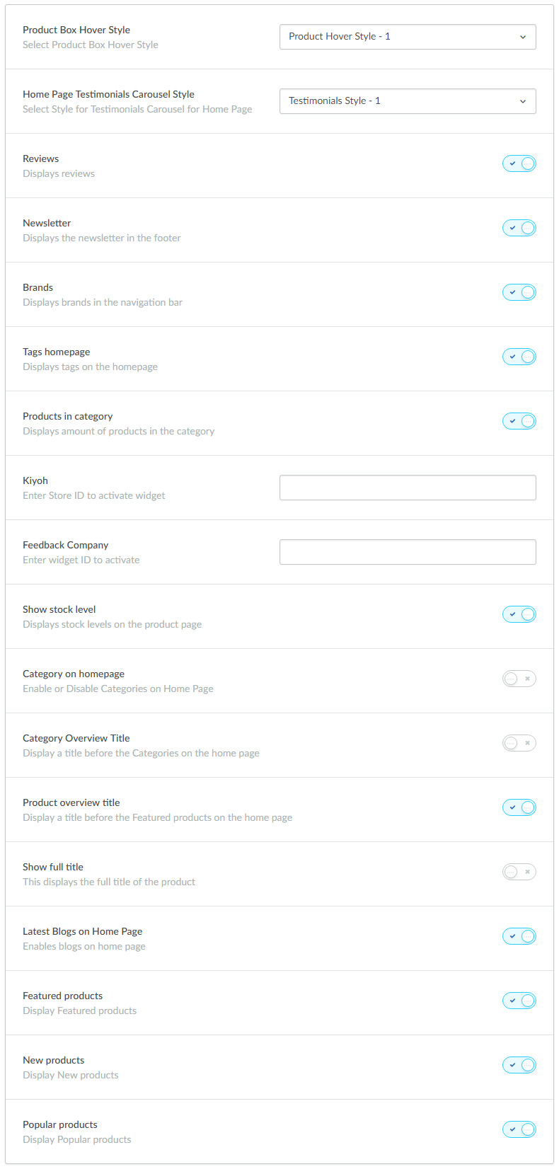
These are the Themes important settings of Theme's to manage some section on the store.
- Product Box Hover Style: You can choose different hover style.
- Home Page Testimonials Carousel Style:You can choose different Testimonials Carousel Style.
- Reviews : Enable Reviews functionality on store products.
- Newsletter : Enable Newsletter section on above Footer area.
- Brands : Display Brand link in Navigation menu.
- Tags Homepage : Displays Tags List on the Homepage Left sidebar area.
- No. of products in category : Show / Hide Product count on homepage categories list.
- Kiyoh : Enter Kiyoh Shop ID to Activate widget.
- Loyalty Lion Key : Enter Key for Your Loyalty lion app to Activate this feature.
- Yotpo : Enter Yotpo Key to enable The Yotpo review feature to store. It'll disable the default review features.
- Feedback Company : Enter widget ID to enable Feedback Company widget.
- Show Fulltitle : Display the fulltitle of the Product Name.
You can enable Or disable the panels on Home Page and manage the blog on Homepage.
- Latest Blogs on Home Page
- Featured Products On Home Page
- New Products On Home Page
- Popular Products On Home Page
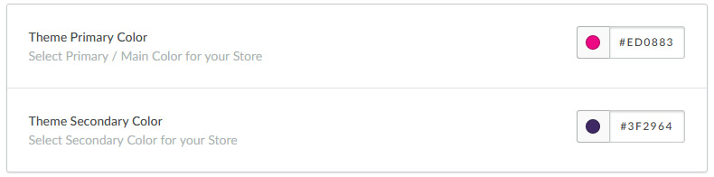
Theme Common Color
These are the Themes important settings of Theme's to manage some section on the store.
- You can change the color of the border, text, background & all other elements
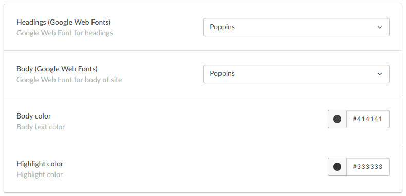
Typography
In this section you will find all the typography related settings such as font-family, font-color etc...
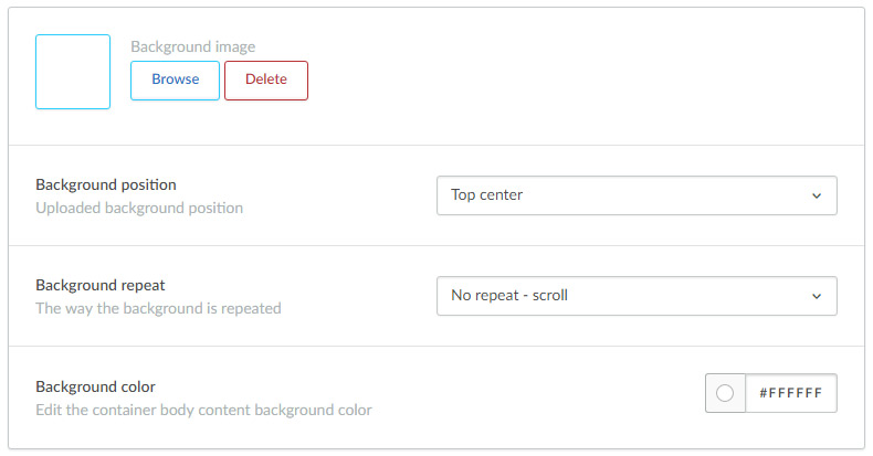
Background
We have created one section called "Background", In this section you will find all the settings related to background so you can adjust the background colors, positions, etc on your website.
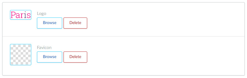
Logo
- Logo : In this section you will be able to make all the logo related changes. You can upload your custom logo here. The Recommended size of the logo is 200px (width) X 60px (height).
- Favicon : Here you can upload your favicon icon.
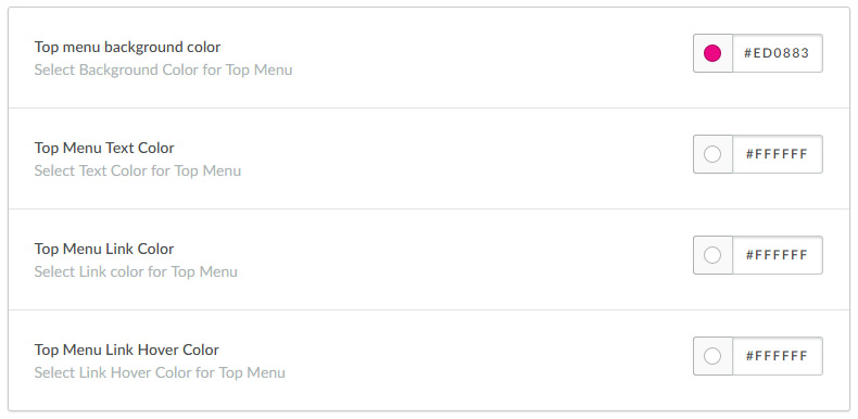
Top Menu
- Top menu background color:You can apply the background-color Top Menu
- Top Menu Text Color: You can apply the Text-color for Top Menu
- Top Menu Link Color:You can apply the link-color for Top Menu.
- Top Menu Link Hover Color:You can apply the link hover-color for Top Menu
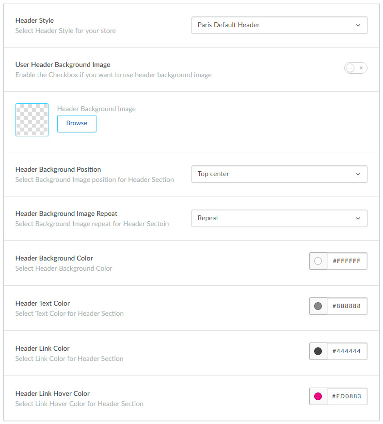
Header Section
- Header Style : You can choose different style Header
- Header Background Image : Enable the Checkbox if you want to use header background image
- Header Background: You can apply the image for Header.
- Header Background position: You can change the Background position.
- Header Background repeat: You can choose Background is repeated.
- Header Background color:You can apply the background-color for Header.
- Header Text color : You can apply the text-color for Header
- Header Link color : You can apply the link-color for Header
- Header Link Hover color : You can apply the link hover-color for Header
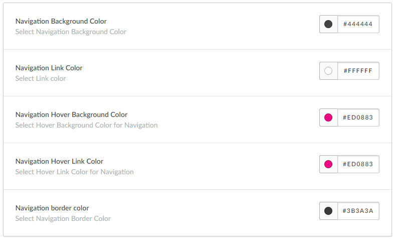
Main Navigation
- Navigation background color:select background-color for Navigation
- Navigation Link Color:select the link-color for Navigation.
- Navigation Hover background Color: select Hover background for Navigation
- Navigation Hover Link Color:select Hover link color for Navigation
- Navigation Border Color:select Border-color for Navigation
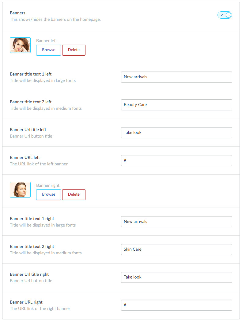
Banners below Image Carousel
This setting will allow you to add additional promotional banners, which can help you to improve your sale.
These banners will display below the image carousel.
In this section you will have freedom to enable/disable the section by un-checking the option. You will also get options to upload your own banner image and you will also be able to assign links to each banner by adding a banner url link.
- Banner: You can enable/disable the section by un-checking the option
- Banner Image : You can apply the image for Banner.
- Banner title text 1 : Title will be displayed in large fonts.
- Banner title text 2 : Title will be displayed in medium fonts.
- Banner Url title : You can add Banner URL button title.
- Banner URL:You can apply the URL for button.
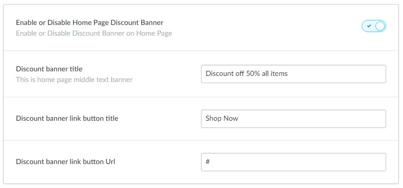
Home Page Discount Banner
- Enable Discount Banner : Enable Discount Banner on home page.
- Discount Banner Title : Set the Discount Banner's Title.
- Discount Banner Link button Title : Set the Discount Banner Link button Title.
- Discount Banner Link : Apply the URL for the Discount Link button.
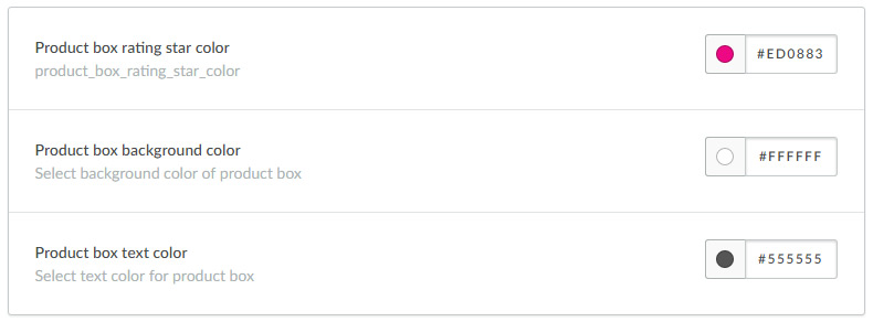
Product Box
- Product box rating star color :Select rating star color of product box.
- Product box background color: Select background color of product box.
- Product box text color : Select text color of product box.
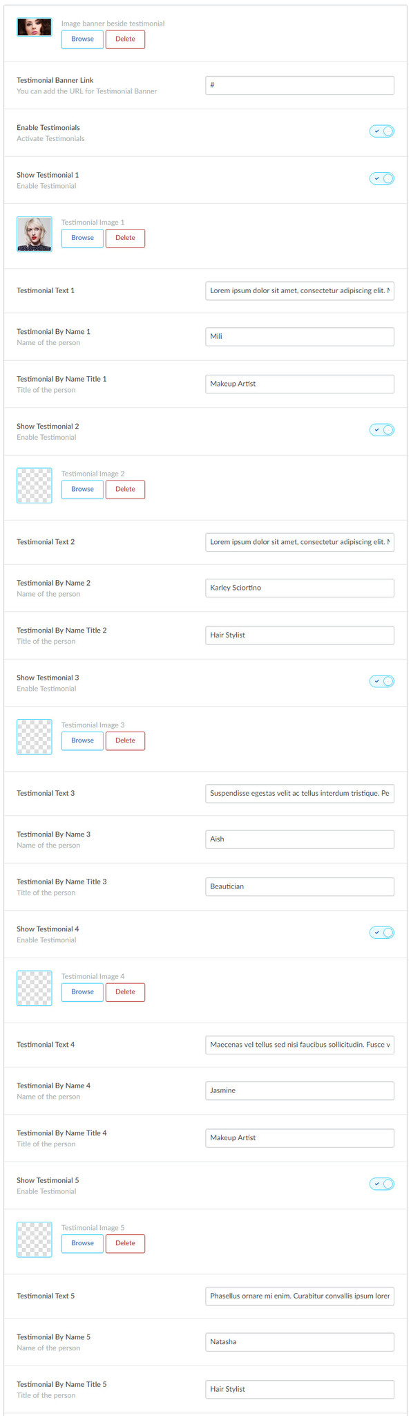
Testimonial Section
- Testimonials Banner Background : Set Background Image of Testimonial Section (720px (width) X 359px (height))
- Testimonials Banner Link : You can apply the link for the Banner image
- Enable Testimonials : Enable Testimonials on Store
- Show Testimonial 1 : Enable Testimonial 1
- Testimonial image 1 : Set the Testimonial Image (150px (width) X 150px (height))
- Testimonial text 1 : Set the Testimonial Content
- Testimonial By Name 1: Set the Testimonial's Author's Name (Name of the person)
- Testimonial By Name Title 1: Set the Testimonial's Title of the person
- As per the above mentioned instruction you can upload all Testimonials for the store
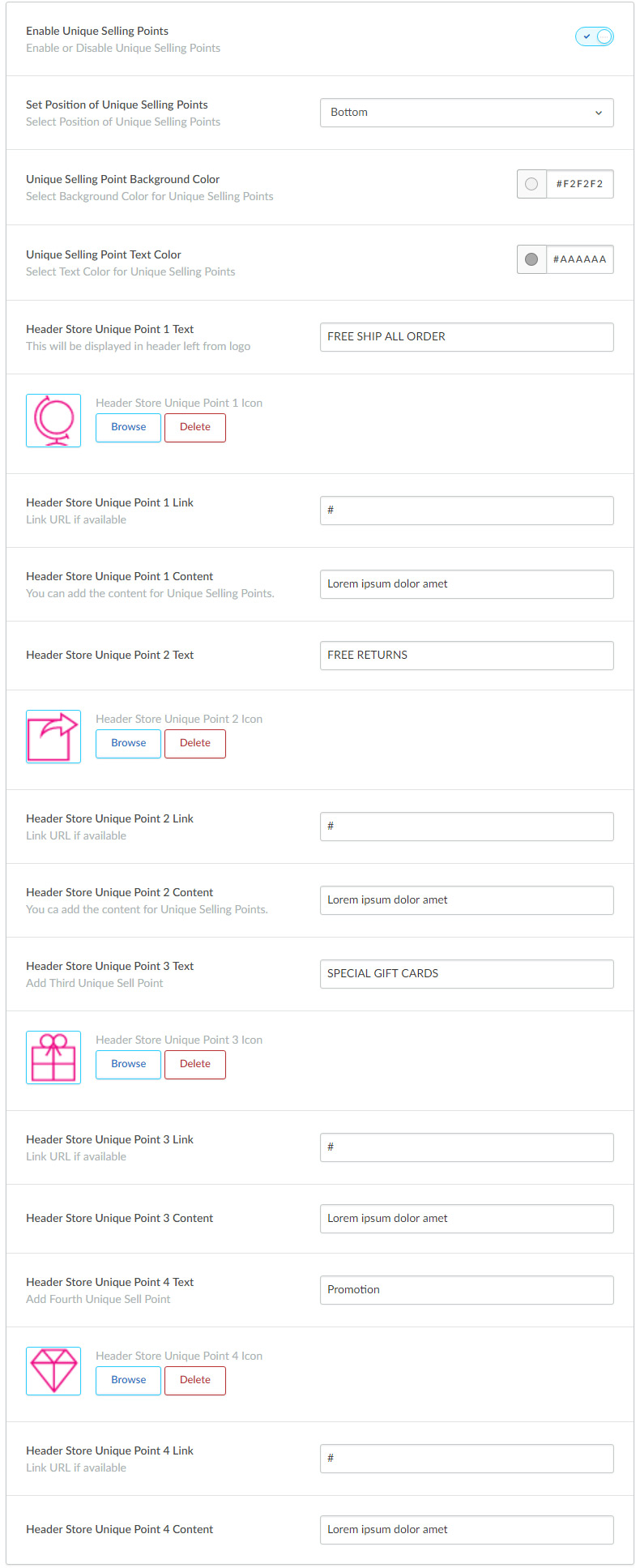
UNIQUE SELLING POINTS
- Activate Unique Selling Points : Enable USPs on Store
- Unique Selling Points Position : Set position for USPs Top/Bottom.
- Unique Selling Points Background Color :Set Background Color for USPs
- Unique Selling Points Text Color :Set text Color for USPs
- Unique Selling Points :Text for USPs *
- Unique Selling Point * Icon :Icon for USPs * (Max height : 38px)(max-width : 38px)
- Unique Selling Points * link :Link for USPs *, Leave blank if you don't want the link.
- Unique Selling Points Content:set the short content for USPs.
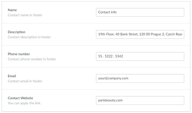
Contact Details
This is one of the best key feature of this theme, here you can specify the contact details, so your customer can easily contact you.
Once you fill all the details in this section, it will display under footer section. Here you can specify your contact name, either it could be your store name or it could be your name as well. Then in the next field you can add a short description, where you can provide some brief about your store.
You can also specify your contact details like, phone number and email address, so users can keep in touch with you.
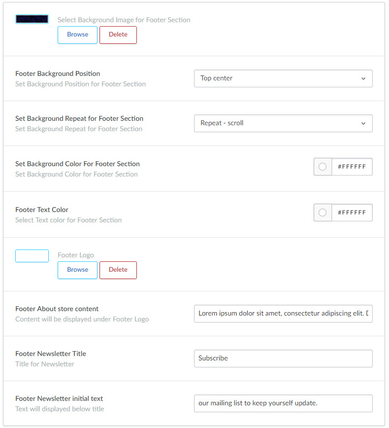
Footer Section
- Footer Background: You can apply the image for Footer.
- Footer Background position: You can change the Background position.
- Footer Background repeat: You can choose Background is repeated.
- Footer Background color:You can apply the background-color for Footer.
- Footer Text color: You can apply the text-color for Footer
- Footer logo: Set the Logo in Footer (max-width:135px;max-height:60px).
- Footer About store content: You can add the short description for the store.
- Footer Newsletter Title: You can add Title for Newsletter.
- Footer Newsletter initial text: Text will displayed below title.
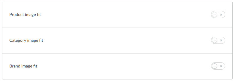
Images
Using this featured you can set the image to be fit into the box. You can enable it by clicking the check box.
This option is available for product image, category image and brand image, so you can enable or disable the setting each section.
Social
You can add social media icons in this section. You can add social media urls for each social icon in order to display theme on header section.
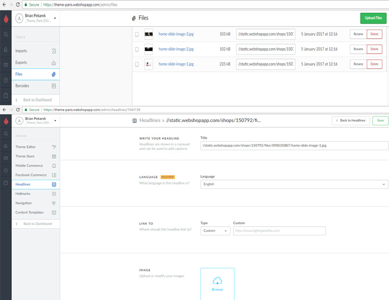
Home Slideshow (HEADLINE)
Here you have a option to set the style for the Home slidershow.
- 1. For headline Images you have to upload the whole image with title & caption from the admin
- https://theme-Paris.webshopapp.com/admin/files
- 2. Now you can just copy the file path from above mentioned admin link & paste it into this title field from admin link
- https://theme-Paris.webshopapp.com/admin/headlines
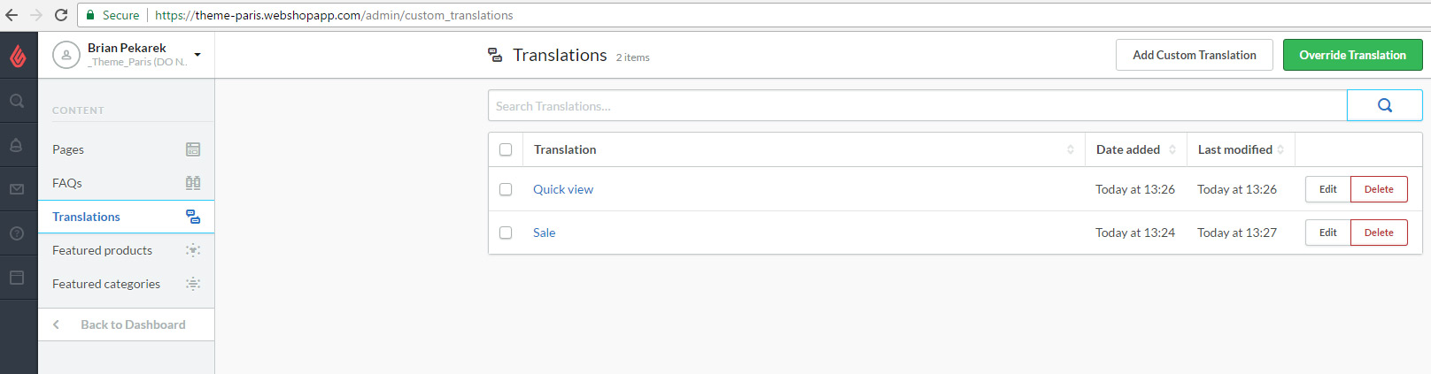
Manual Translations
Here you have to change the key-word for the Translations
- Banner-top
- 1. New arrivals
- 2. Beauty Care
- 3. Take look
- DiscountBanner
- 1. Discount off 50% all items
- 2. Shop Now
- Unique Selling Points
- 1. FREE SHIP ALL ORDER
- 2. Lorem ipsum dolor amet
- As per the above mentioned instruction you can Translat all Unique Selling Points for the store
- Footer Section
- 1. Lorem ipsum dolor sit amet, consectetur adipiscing elit. Donec eleifend dui mi, ut pretium purus tempus ac. Sed ut commodo velit. Pellentesque eu felis molestie, elementum ligula eget.FREE SHIP ALL ORDER
- 2. Subscribe
- 3. our mailing list to keep yourself update.
Reset The Paris Theme Setting
You can always comeback to default setting, simply by following below steps.